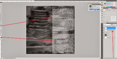
In terms of editing the inside panels for the digipak, I edited them all in exactly the same way, to keep a professional look of consistency and continuity - the only difference was the actual images and the lyrics of the songs on the panels.
The first thing I did was open up a photoshop file to edit the first of the photos I had taken. I clicked on 'Image' on the top option bar and then 'Canvas Size', to which I then changed the measurements in order to create a square file - the typical digipak shape.
I then downloaded a ghost effect from the internet called 'Ghostify', and added it to my image to give it an eerie and ghost-like look to fit my theme of 'mystery' and the 'conflict between what is real and what is not'. This effect made my image a little blurred with a higher contrast, and a green-ish tinge, so that the image looks more surreal, to fit the generic conventions of the alternative rock band I am promoting.
I then added a new layer and dragged and dropped my image into it on the photoshop file, and then clicked on the top bar 'Image' and then 'Adjustments' and then 'Black and White'. I clicked 'Ok' on the default black and white settings to change my eerie image to entirely black and white. Firstly this also makes the digipak look more spooky with connotations of death or surreality, but it also makes the digipak inside panels differ from the outside panels.
I then decided that the panel should be darker, so that the lyrics I would add on would be more visible, so I created a new layer over the top of the image and using the paintbrush tool (making sure the colour in the palette was black), I 'painted' over the entire thing, and turned the opacity down, which gave the image a black tint.

Afterwards I decided to add lyrics to the panel, which is a usual convention of all digipaks. I drew a textbox on the side of the panel which would be best covered up by the text (for example, so the mysterious looking stairs were still visible) and then typed out my own lyrics to the first song on the album. I made sure the colour was white, so that it was clearly readable, and I used the font 'Copperplate Gothic' because the style of the font is quite fantasy looking and also gothic looking, to fit with the generic conventions of the alternative rock band, but also because the font itself is clearly readable. Underneath i typed out the lyrics for the second song 'Her Name Is Alice' which was the only song on the album which wasn't my lyrics, because it is the song on the music video that we created after asking for permission to use it from the original band who sing it - Shinedown. I made sure the lyrics were quite small so that I could fit 2 to 3 songs on each digipak inside panel, so that all of the song's lyrics on the album could be included in the panels with none left out.
Finished inside panel:
For the rest of the inside panels, I did the same thing but made up new lyrics for the rest of the songs, putting another two songs on another panel, and three songs each on the other two panels.


No comments:
Post a Comment