Friday, 29 November 2013

Conventions That I Have Used in My Digipak and Advert

Digipak:


  • Dark colours and filters to fit the typical genre conventions of a dark and alternative band.
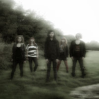
  • An image of the band which is typical to promote band image.
  • Ghost-like effect to fit the theme of surreality - a genre convention.
  • Lyrics on the panels to fit a typical digipak style.
  • Copperplate Gothic font to fit with the darker style of music.

Magazine Advert:


  • Dark colours and filters to fit the typical genre conventions of a dark and alternative band.
  • An image of the band which is typical to promote band image.
  • Ghost-like effect to fit the theme of surreality - a genre convention.
  • Album reviews from established music companies to fit a typical style of magazine advert.
  • Copperplate Gothic font to fit with the darker style of music.
  • QR code for an audience to gain more information - key convention of modern adverts.
  • Reference of where to buy the single from (iTunes) - key convention of music adverts.
  • Album picture and name in the same style as the digipak to an audience can link the two.
  • Initial Feedback

    After receiving back my feedback from my target audience on the feedback forms, overall the response seemed very positive.
    Everybody likes the digipak and advert, and thinks it looked mysterious. Most people also think it fits the theme of surrealism and the genre conventions of dark and alternative rock. Nobody suggested any improvements other than changing the opacity slightly on the single cover on the magazine advert.

    Thursday, 28 November 2013

    Saturday, 23 November 2013

    Magazine Advert Editing

    Firstly I opened up a new Photoshop file and changed the canvas size so that it was A4 size - a typical magaine advert size, by going to the 'Image' option on the top bar and clicking 'Canvas Size'.


    Next I opened up the edited photo of my front cover of the digipak and dragged it onto my new file, stretching it outwards so that it filled the frame. This is a good technique to promote the digipak because the audience can associate the two things together and recognise the band image easily. 

    Next I added a new layer and opened up the single cover of 'Her Name Is Alice' and dragged it onto the layer. I re-sized the image to make it smaller and in the corner of the advert. This is to promote the debut single which is available to buy on iTunes. I then changed the opacity slightly so it didn't stand out too much against the main image.


    In addition to this I then added a white outline to make it more noticeable, by adding a new layer, and with the colour white, I drew around the single logo with the line tool, and then changed the opacity slightly.

    Using the 'Copperplate Gothic' font, in white, I then added a textbox explaining the availability of the song on iTunes, and then changed the opacity to the same as the logo. I then added the band name and album name in the same font, to look professional by co-ordination and also to match the digipak. I changed the colour of the band name to grey, and on the album name, to match the same style as the digipak, I added a drop shadow, inner glow and a gradient. I did this by double clicking on the layer and clicking through the options on the left-hand side of the box that appeared. On the actual text I also added a strike-through to also match the digipak.
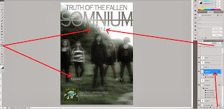
    After that I added more text-boxes on new layers, and typed the date of the album release and also names of music companies which would have reviews of the album. I made the date grey, and the company names white, and changed the opacity of each to further fit with the theme. These were also in 'Copperplate Gothic' to fit the theme, and I then adjusted the size to fit the advert appropriately.


    The next thing I did was import a picture of a QR code from the internet, adding it onto a new layer. This would allow an audience to scan the code to receive more information about the album on their mobile. I added it into the bottom right-hand corner of the advert, which is where this would typically be on other music adverts.
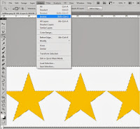

    Then, I decided to add some stars as a rating system for the reviews on the magazine advert. I found a suitable image from the internet and opened it up in a new Photoshop file and then with the magic wand tool selected the white area. I then clicked 'select' and 'inverse', and copied and pasted the stars into a new layer. I then deleted the background and used the paint-bucket tool to change the stars to white. Using the select tool, next I dragged the white stars onto my magazine advert under the company headings. I decided to change one of them to 4 stars as opposed to 5 stars to be more realistic so I cropped one star off of the end using the rectangular tool.


    Front and Back Cover Editing

    Firstly, I started on the front cover. I opened up a new Photoshop file and changed the canvas size to a square under the option 'Image' and 'Canvas Size' because this is the usual shape of a digipak. I then opened up a new photoshop file and did the same thing, which I would use for my back cover, as I worked on them side-by-side.


    On the front cover, the guitarist of the band's head looked a little too faded into the background due to the lighting. Using the lasso tool, I drew around his head, and copied and pasted it into a new layer. On this layer, I then changed the curves and contrast until it was more visible, and then used the blur tool to go around the edges of this shape so it wasn't as obvious that it had been cut out and edited. 


    Then on Photoshop, I decided the sky in the photo was a little burnt out and too bright on both covers of the digipak. Firstly on the front cover, I added a new layer over the image layer and using the paintbrush tool with the colour black I covered a lot of the sky, and changed the opacity down to fade this out more subtly. I also added a few more darker bits around the trees with the burn tool and faded this area with the blur tool so that the edges of this darker layer were't visible. I then repeated this process with the sky on the back cover.


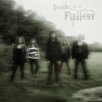
    Using the downloaded effect of 'ghostify' from the internet, I made my chosen front cover image look eerie and ghost-like, to fit with the generic conventions of alternative rock (associated with more depressing and mysterious concepts), and also to fit with the theme of surrealism involved in my digipak. I then did the exact same things to the back cover.


    On the front cover, I had downloaded the font 'Bleeding Cowboys' from the internet because this is the font that I have used throughout to represent the band logo. I typed it into a textbox in grey, which matches the colour scheme, and then turned the opacity down to make it more ghostlike. I put it in the area of the sky on the image because this area was quite blank, and therefore it would stand out more.


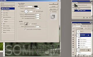
    For the album name, I decided to use the font 'Copperplate Gothic' because this is a running theme in my digipak that fits the generic conventions. I typed the word 'Somnium' into a textbox in this font (the name of my digipak meaning 'dream' to fit the theme of surrealism), and added a strike-through to make the word look more edgy. I placed it at the bottom in the middle of the digipak, a typical place for the album title to go, and also the place where it was most noticeable, and I stretched it across to fit the width of the cover. To make this title stand out more and seem more professional, and to fit the generic conventions of a more heavy band with a rock/metal genre, I added some effects to it, by double clicking on the layer and under the different tabs, I added a gradient, drop shadow and an emboss effect. 

    On the back cover I decided to use the 'Copperplate Gothic' font for the track-listing of songs I had made up to match the rest of the digipak. I typed it out in a list format - a typical digipak layout - in grey the dark ghostly colour scheme, and I then reduced the opacity to emphasise this.

    I added small-print onto the bottom of the back of the digipak containing the copyright details and record labels of the album and music, which is a usual requirement for digipak's. I made it white, in a clear 'Arial' font so that it was still readable despite its size.

    I added a barcode to the back of the digipak because in terms of distribution a barcode is required in order to purchase it. For this I found a picture of a barcode on the internet and imported it onto my digipak image. I put it in the bottom right-hand corner because this is typically where it goes.

    On digipaks it is usually a legal requirement to have the record label logos and distribution product logos, although they are usually quite small because it is still the band that is being promoted and not their label. I opened up the Atlantic Records logo (the company who own Shinedown who originally own 'Her Name Is Alice') and also the Dolby Digital logo and the DVD video logo. I selected the backgrounds, and deleted then, and then using the bucket fill tool I changed the overall colours of them to white to fit well with the rest of the colour scheme of my digipak. I also changed the opacity down slightly to match the shostly theme of the digipak so they aren't too striking. I then dragged them across to import them into my back cover and I arranged them at the bottom of the image where they would typically be on a digipak.


    Thursday, 21 November 2013

    Panel Editing

    In terms of editing the inside panels for the digipak, I edited them all in exactly the same way, to keep a professional look of consistency and continuity -  the only difference was the actual images and the lyrics of the songs on the panels.

    The first thing I did was open up a photoshop file to edit the first of the photos I had taken. I clicked on 'Image' on the top option bar and then 'Canvas Size', to which I then changed the measurements in order to create a square file - the typical digipak shape.

    I then downloaded a ghost effect from the internet called 'Ghostify', and added it to my image to give it an eerie and ghost-like look to fit my theme of 'mystery' and the 'conflict between what is real and what is not'. This effect made my image a little blurred with a higher contrast, and a green-ish tinge, so that the image looks more surreal, to fit the generic conventions of the alternative rock band I am promoting.


    I then added a new layer and dragged and dropped my image into it on the photoshop file, and then clicked on the top bar 'Image' and then 'Adjustments' and then 'Black and White'. I clicked 'Ok' on the default black and white settings to change my eerie image to entirely black and white. Firstly this also makes the digipak look more spooky with connotations of death or surreality, but it also makes the digipak inside panels differ from the outside panels.


    I then decided that the panel should be darker, so that the lyrics I would add on would be more visible, so I created a new layer over the top of the image and using the paintbrush tool (making sure the colour in the palette was black), I 'painted' over the entire thing, and turned the opacity down, which gave the image a black tint.


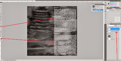
    Afterwards I decided to add lyrics to the panel, which is a usual convention of all digipaks. I drew a textbox on the side of the panel which would be best covered up by the text (for example, so the mysterious looking stairs were still visible) and then typed out my own lyrics to the first song on the album. I made sure the colour was white, so that it was clearly readable, and I used the font 'Copperplate Gothic' because the style of the font is quite fantasy looking and also gothic looking, to fit with the generic conventions of the alternative rock band, but also because the font itself is clearly readable. Underneath i typed out the lyrics for the second song 'Her Name Is Alice' which was the only song on the album which wasn't my lyrics, because it is the song on the music video that we created after asking for permission to use it from the original band who sing it - Shinedown. I made sure the lyrics were quite small so that I could fit 2 to 3 songs on each digipak inside panel, so that all of the song's lyrics on the album could be included in the panels with none left out.


    Finished inside panel:


    For the rest of the inside panels, I did the same thing but made up new lyrics for the rest of the songs, putting another two songs on another panel, and three songs each on the other two panels.


    Decided photos for digipak

    I decided on keeping my initial ideas about the front and back cover the same, but the inside panels different. Instead of another band photo for the fold-in panel, and smoke for the inside panels, I decided to have mysterious woodland shots to link to the debut single 'Her Name Is Alice' but also to connote mystery and eeriness - a big theme of the music in my digipak, which fits the generic conventions of the band I am promoting - Truth Of The Fallen. I will also use this idea for a picture on the disc also.

    Front cover panel from initial photoshoot:


    Back cover panel from initial photoshoot:


    Fold-in panel:


    Inside Panels:


    Disc: