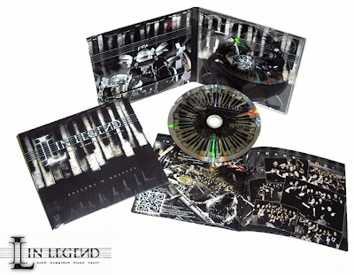
I have decided to make a magazine advert for the album of the band (the digipak I have created) because I think promoting the album is the best way the band can become successful as an establishing band in terms of finance, as well as just achieving fame if only the band were promoted as opposed to their music as well. I have analysed some magazine adverts for albums that have been promoted by band's of a similar genre to the one that we have created for our music video. All of these adverts feature the date that the album will be released, which is important for being informative and useful to the audience if they are persuaded to buy the album from the advert.
Lostprophets are an alternative rock band similar to Shinedown (the band who originally sang the song we chose for our music video) and released a magazine advert for their album 'The Betrayed'. The colours are very dark, including blacks, blues and purples, to match the darker genre of the band and song meanings. The white text makes the album name and band name stand out to be clear to the audience and act as an audience hook, which is more professional. This white text also seems to be glowing, almost ghost-like, to give a spooky atmosphere to the advert to further match the band genre, and as a concept I am interested in for the promotion of my band, I can take this into account when making my advert. The actual imagery that is used is the same as the imagery used on the album cover, although the album cover features more electric lightening type effects as well, where matching the two things together is a professional technique so that the audience associate the two things together. It also acts conveniently to the audience, where they are able to establish whether they are buying the right album when they go to find it in a shop, if they already recognise the cover. The imagery features the band, which therefore promotes the band as a whole as well as the album. The production/record company and distribution company logos are clearly seen on the bottom of the page in white to avoid legality debate and stand out, and in a way promote the company as well.
Strange House by The Horrors is another album of the darker genre - garage/post-punk. The imagery involves the band, which promotes the band as well as just the album, and this image directly links to the album name. The band are sat in quite an obscure looking room, with strange mise-en-scene like the patterned curtains and animal head on the wall, which fits the description of a 'strange house' - the album of the band. This direct link is more professional because it is clear-cut to the audience. The imagery is also the exact imagery used on the album cover, so that the audience can associate the two things, making it easier for the audience when buying the album, although the colour effects and placement of the title are different so that the audience can distinguish that the album and the advert are like two media products individually. The image has a sepia effect,to create a more creepy atmosphere, and reinforce the genre. The contrast is also high, to make the band look more gothic and more strange, also relating to the 'strange house' idea. The title text of the band is the band logo, which also works as a promotion technique to familiarise an audience with the band. The title of the album is in the same font as the band logo, so that the audience can associate the album with the band themselves. This text is white, along with the rest of the text on the album, to stand out against the background so it is very clear to the audience and make the advert more professional. The production and record label logos can be clearly seen at the bottom of the page for legality reasons and so the audience can associate these labels with the type of music from the band and how famous the band are.
This magazine advert for Green Day (punk band) is quite different to the others. Firstly, Green Day are a more established famous mainstream band, and this advert doesn't just promote the album, it promotes the single as well. It doesn't promote the band that much either, because only Billie Joe Armstrong, the front-man, is involved with the imagery, so that the audience are aimed to associate the single 'Wake Me Up When September Ends', which the advert is promoting, with Billie Joe himself. The poster seems to be split in half, with the single image clear for the audience to be hooked by on the top half of the advert, with a black banner across the bottom half containing the information. This banner is then split in two so that each side represents a different item belonging to Green Day that is being promoted, to make it clear to the audience, which is more professional. The colour scheme is red, black and white, typically punk colours to match the genre of the music, but also match the typical Green Day iconography, such as the album cover for American Idiot which is featured in the promotion for the album section, so that the audience can associate this running theme with Green Day themselves. All of the text is bold and simple, so it is clearly readable and so more useful to the audience and also more professional. The use of the album cover also helps the audience to remember what it looks like when they aim to buy the album. The production logos for legality are featured in the bottom corner, along with the charity Green Day themselves are promoting, which further acts as a hook to the audience because it makes them feel like they can help with the charity if they buy Green Day merchandise. As the band I am trying to promote are just starting out as an establishing band, some of the conventions used in this advert may seem less relevant, but it is useful to establish layouts for the genre of music I am concerned with.
This You Me At Six album advert for 'Hold Me Down' I found very interesting because it doesn't feature the band at all. The band are already quite an established band, and so instead, the advert completely features around the promotion of the album. The imagery used is exactly the same as the album, so that the audience can easily associate the two things, and matching these things in this way creates a running theme to make it more professional. The band logo text is used for the band name title here, so that existing audiences can create a link between all of the band's music, but also for new audiences to familiarise themselves with the band. The imagery directly relates to the album name 'Hold Me Down' from the use of a tape effect where the band name is, as if holding down this band name, and a variety of different colours, smoke objects like flowers and wings all coming out of the top of the band name in quite an explosion manner, as if they were held down and now they are bursting out.The general colour scheme of the advert matches the colour scheme of the album, including the white and yellow themes of the text and the greenish background, to create a professional running theme; this use of a lot of colour describes the nature of the band - bright and bubbly and the more upbeat end of rock music. The distribution logos and production logos for legality are also shown on the bottom of the page.


